02. Scatterplots and Correlation
L4 021 Scatterplots And Correlation V2
Data Vis L4 C02 V1
Scatterplots
If we want to inspect the relationship between two numeric variables, the standard choice of plot is the scatterplot. In a scatterplot, each data point is plotted individually as a point, its x-position corresponding to one feature value and its y-position corresponding to the second.
matplotlib.pyplot.scatter()
One basic way of creating a scatterplot is through Matplotlib's scatter function:
Example 1 a. Scatter plot showing negative correlation between two variables
# TO DO: Necessary import

# Read the CSV file
fuel_econ = pd.read_csv('fuel_econ.csv')
fuel_econ.head(10)

# Scatter plot
plt.scatter(data = fuel_econ, x = 'displ', y = 'comb');
plt.xlabel('Displacement (1)')
plt.ylabel('Combined Fuel Eff. (mpg)')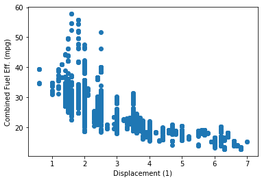
In the example above, the relationship between the two variables is negative because as higher values of the x-axis variable are increasing, the values of the variable plotted on the y-axis are decreasing.
Alternative Approach - seaborn.regplot()
Seaborn's regplot() function combines scatterplot creation with regression function fitting:
Example 1 b. Scatter plot showing negative correlation between two variables
sb.regplot(data = fuel_econ, x = 'displ', y = 'comb');
plt.xlabel('Displacement (1)')
plt.ylabel('Combined Fuel Eff. (mpg)')
The basic function parameters, "data", "x", and "y" are the same for regplot as they are for matplotlib's scatter.
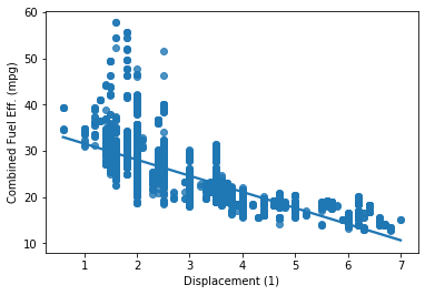
The regression line in a scatter plot showing a negative correlation between the two variables.
Example 2. Scatter plot showing a positive correlation between two variables
Let's consider another plot shown below that shows a positive correlation between two variables.
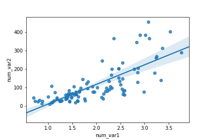
The regression line in a scatter plot showing a positive correlation between the two variables.
In the scatter plot above, by default, the regression function is linear and includes a shaded confidence region for the regression estimate. In this case, since the trend looks like a \text{log}(y) \propto x relationship (that is, linear increases in the value of x are associated with linear increases in the log of y), plotting the regression line on the raw units is not appropriate. If we don't care about the regression line, then we could set fit_reg = False in the regplot function call.
You can even plot the regression line on the transformed data as shown in the example below. For transformation, use a similar approach as you've learned in the last lesson.
Example 3. Plot the regression line on the transformed data
def log_trans(x, inverse = False):
    if not inverse:
        return np.log10(x)
    else:
        return np.power(10, x)

sb.regplot(fuel_econ['displ'], fuel_econ['comb'].apply(log_trans))
tick_locs = [10, 20, 50, 100]
plt.yticks(log_trans(tick_locs), tick_locs);
Note - In this example, the x- and y- values sent to regplot are set directly as Series, extracted from the dataframe.
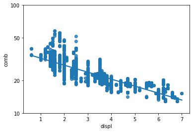
Regression line on a scattered plot based on the log-transformed data